Product photos often decide more than the description. If everything in the frame is technically correct, but the background distracts, reflects incorrectly, or gives a cheap impression, both the perception of the product and conversion suffer. That is why the best backgrounds for product photography are not just a matter of aesthetics - they directly affect how professional your content looks in your e-shop, on social media, and in advertising materials.
In brief
- Start with a matte white or light gray background as a universal base for catalogs and color checking.
- Choose the material based on use: paper — smooth transitions and easy replacement; vinyl/PVC — durability and easy cleaning.
- Control the lighting and the distance between the product and the background to avoid reflections and grayness.
- Textured backgrounds are suitable for lifestyle and advertising shots, but should be used carefully so the product does not lose dominance.
What to choose for different tasks
| Task | Solution | Why |
|---|---|---|
| E-commerce catalogs and product pages | Matte white or light gray paper or vinyl background with even lighting | Neutrality makes post-processing easier, ensures a consistent visual style, and more accurate color matching |
| Premium electronics, watches, perfumes | Matte gray or black vinyl with edge lighting or side accents | Dark or gray tones emphasize shape and material, helping to highlight light contours and a premium feel |
| Small items — jewelry, cosmetics, accessories | Smooth paper background or a small seamless table together with reflectors and precise lighting | Detail visibility and clean edges are important; paper provides a smooth, easily controllable surface |
| Food and drinks — advertising and social media | Textured backgrounds (wood, stone, fabric) or matte vinyl depending on the mood | Texture adds context and atmosphere, but it should not be overdone so the product does not lose attention |
| Intensive studio work and high-volume photo sessions | Vinyl or PVC background with an easy-to-clean surface and spare rolls | Durability and quick cleaning reduce interruptions and ensure long-term consistency |
| Lifestyle campaigns and advertising shots | Textured fabric or vinyl backgrounds combined with props and specific effects | Provides a visual story and mood, but the product must remain dominant in the frame |
Frequently asked questions
What background is best for an e-commerce catalog?
Most often, a matte white or light gray background is recommended because it is neutral and makes post-processing easier. It is important to add enough distance between the product and the background and use even lighting to avoid shadows or grayness.
When is it better to buy background material, and when to rent it?
If you photograph regularly (online store, content team), investing in your own backgrounds usually pays off quickly. For short-term campaigns or seasonal projects, it can be beneficial to rent backgrounds and other studio accessories to test solutions without large expenses.
How can I reduce reflections on glossy products?
Use matte surfaces, controlled light, and sufficient distance between the product and the background, and consider edge lighting or side lighting to define the shape. Sometimes reflectors or diffusers are useful for softening strong reflections.
How do I choose between a paper and a vinyl background?
Paper provides a smooth, seamless transition and is easy to replace, but it is less resistant to moisture and dirt. Vinyl/PVC is more durable and easier to clean, but some vinyl rolls can have a shinier surface that requires adjusting the surrounding light.
How large a background do I need — is a small roll enough?
Choose the background size with some reserve so there is enough space in the frame and no visible edges or folds, especially for angled or composite shots. In practice, it is sensible to start with standard rolls and later add wider ones if composition limitations occur often.
Does background color affect white balance and color matching?
Yes — the background tone affects the perception of white balance, shadows, and the color of ambient light. If accurate color reproduction is required, it is better to choose a neutral white or gray tone and control the lighting.
Useful links
- Special effects for product photography - Ideas and materials for adding texture and stylistic effects to lifestyle shots.
- Photo studio accessories - Stands, mounts, and other accessories that make background setup and lighting placement easier.
- Product photo tables - Stable and seamless surfaces for small products when precision and compact shooting are needed.
- Backgrounds, Holders, Reflectors - Rental is a convenient solution for short-term projects or experiments with different backgrounds and support equipment.
- Studio equipment bags - Practical storage and transport for background rolls, reflectors, and other accessories.
When choosing a background, there is no one universally correct option. What works well for cosmetics does not always suit electronics. Meanwhile, clothing, jewelry, and food have even more different needs. A practical choice always starts with three questions - what you are photographing, where the image will be used, and how repeatable your shooting process is.
How to understand which are the best backgrounds for product photography
A good background does two things at once. First, it does not overwhelm the main object. Second, it helps control light, contrast, and color perception. If the background is too shiny, you will get unwanted reflections. If it is too textured, fine details may disappear. If the tone is inaccurate, color matching will suffer, which is especially important in images of fashion, interior, and design products.
In practice, this means that a background should not be judged only by its appearance. Material, surface finish, size, durability, and how quickly the background can be changed between shots are also important. If you photograph regularly, workflow is just as important as the final result.
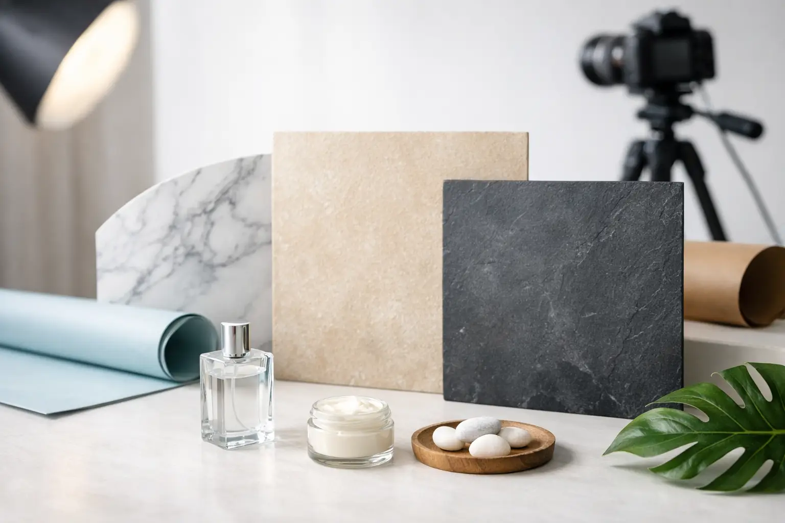
White background - the safest solution for a catalog
A white background is still the standard in e-commerce, and for good reason. It allows the product to stand out, makes post-processing easier, and works well on platforms that require a neutral, unified visual style. If the goal is a catalog, marketplace, or online store product page, a white background is usually the first option to consider.
However, a white background is not as simple as it seems. If the surface is not matte enough, unwanted reflections will appear on glossy products. If the lighting is uneven, the white will turn gray or yellowish. This is especially visible when photographing glass, metal, laminated packaging, or electronics with glossy surfaces.
That is why a white background is best used together with controlled light and enough distance between the product and the background. This helps reduce shadows and keep a clean outline.
Gray and black backgrounds - for a controlled, premium look
If a white background feels too technical or flat, gray is a very flexible alternative. A medium gray tone helps you judge exposure more accurately, does not create such aggressive contrast, and works well for both light and dark products. It is especially useful when photographing metal objects, watches, audio equipment, or premium packaging.
A black background can create a very strong visual effect, but it requires more discipline. Glass, chrome details, perfumes, electronics, and luxury segment products look good on a black background. At the same time, black backgrounds quickly reveal dust, scratches, and incorrect light placement. If the product itself is dark, it may blend into the background, and you will need to work with edge lighting or side accents.
Paper backgrounds - a convenient standard for everyday work
Studio paper backgrounds are one of the most practical solutions for product photography. They provide a smooth, even surface without unnecessary texture, are available in various tones, and work well for both smaller tabletop items and larger shooting tasks. If you need a clean transition between the vertical plane and the surface, paper allows you to create a seamless background.
This solution also has its limitations. Paper is not particularly resistant to moisture, scratches, and dirt. If you photograph cosmetics with liquids, food, drinks, or products that you move often, you will need to replace the background more regularly. On the other hand, that is exactly why paper is convenient - you simply roll away the worn section.
Vinyl and PVC backgrounds - when durability matters
If the working environment is intensive or products tend to leave marks, vinyl or PVC backgrounds are often a more practical choice than paper. They are easier to clean, more durable, and suitable for repeated use. Such a solution is good for packaging, kitchen products, cosmetics, drinks, and other items where drops, crumbs, or fingerprints may occur during shooting.
However, it should be noted that some vinyl backgrounds reflect light more than paper. If hard light or the wrong angle is used, shiny bands may appear in the frame. That is why it is important to assess the surface matte finish before choosing, not just the color or size.
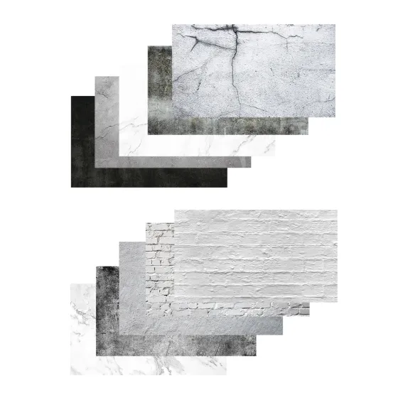
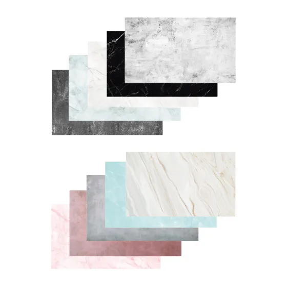
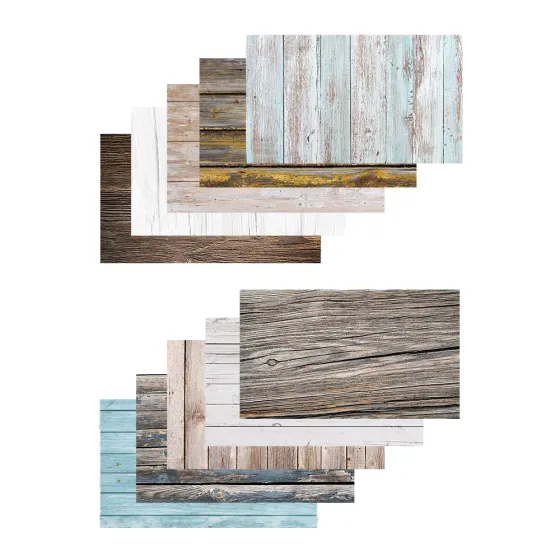
Textured backgrounds for lifestyle shots
Not all product images need to look like a catalog. In social media content, advertising, and brand visual communication, textured backgrounds often work better - wood effect, stone, concrete, fabric, or painted surfaces. They help add context and mood, especially when photographing food, handmade products, candles, interior items, or gift products.
The key here is not to overdo it. The more pronounced the texture, the greater the risk that the product will lose dominance. A subtle background can support the story, but an aggressive pattern creates visual noise. If the product is small or the packaging is already colorful, the background should be much calmer.
 ProductCaruba Backdrops Stone 10 Pack 5x2 Flat LaysView product
 ProductCaruba Backdrops Marble 10 Pack 5x2 Flat LaysView product
 ProductCaruba Backdrops Wood 10 Pack 5x2 Flat LaysView product
How to choose a background by product category
For small items such as jewelry, watches, cosmetics, or accessories, smooth, neutral backgrounds with controlled reflections usually work well. Precision and clean edges are important here, because there are many small details in the frame.
For clothing and shoes, you often need to choose between a technical and an emotional approach. Catalog photos will need a simple background, while campaign images can use texture or a color that matches the style of the collection. For electronics and premium goods, gray, black, or dark textured backgrounds usually work well, as they help emphasize shape, material, and light contour.
For food and drinks, everything depends on the desired mood. A clean white background creates a commercially neutral result, while stone, wood, or matte colored surfaces often look more convincing in advertising and social media content.
Color is not just design, but also a technical decision
Background color affects not only aesthetics, but also white balance perception, the character of shadows, and product color reproduction. A warm beige or wood tone can create a pleasant atmosphere, but at the same time make white products look yellowish. A cool gray background may look clean and modern, but for some skin tones, cosmetics, or food it can create too sterile a feeling.
If precise color matching is important for the product, the safest solution is a neutral white, gray, or a very restrained tone. In brand campaigns, the background color can be matched to the identity, but only if the product still remains in the foreground.
Practical details that are often noticed only after the first photo session
The background size should be chosen with a margin. Many people start with a surface that is too small and only during the shoot realize that the edges are visible in the frame, there are folds, or there is not enough space for light. This is especially relevant for angled shots, 45-degree angles, and compositions with props.
Another common mistake is choosing a background for only one specific product. If you photograph regularly, it is more cost-effective to build a small base set - white, gray, and one textured option. This gives flexibility without unnecessary spending and allows you to maintain a consistent visual language.
If backgrounds are used for commercial work, their repeatability is also important. A tone that works once will not be useful in the long term if you cannot quickly recreate or replace it. That is why, in a professional environment, the most predictable solution often wins over the most exotic one.
When to buy and when to rent
If product photography happens regularly, having your own backgrounds usually pays off quickly. This applies to online stores, content teams, and studios that need consistent quality and availability without waiting. For short-term campaigns, seasonal projects, or tests before a larger investment, it may also be worth considering a rental approach together with other studio equipment.
That is why not only the background itself is important, but also access to the rest of the equipment - lights, stands, mounts, and surfaces. If everything is planned as a system, the result is significantly more stable than when each element is selected separately. In such situations, specialized advice is also useful, because the best background always works together with proper light, not on its own.
If you have to choose one starting point, it is safest to begin with a matte white or light gray background and only then add darker or textured solutions. This allows you to understand your working style without overpaying for a background that looks impressive in the frame but sits on the shelf in practice. A good background is not the one that attracts attention. A good background lets the product sell itself.